Michigan Internet Marketer Explains: 3 HUGE Web Design Mistakes
How would you rate your website? Think hard before you answer this.
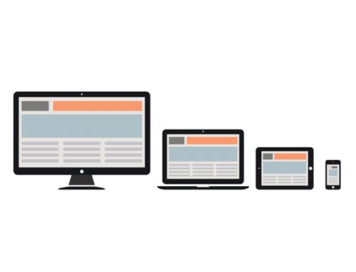
Is your website pleasing to the eye? Does it have a lot of fresh content? Is it mobile friendly?
These should be obvious concerns when designing or redesigning your site.
But simply having a professional, mobile-friendly website with quality content may not be enough to convert your visitors to customers. What else should you consider when designing a website with a high-conversion rate
3 Things Keeping You From Converting Web Visitors Into Customers
Lack of Communication
 See this guy that looks stressed out? That is because he is looking for your phone number on your website. After he couldn’t find that he tried to find the contact form but there was just an email address that he now has to copy and paste into his mail program…after he loads it.
It may sound like this guy is just plain lazy or impatient, but most internet users are in a hurry and want to find what they are looking for instantly. This is especially true for smart phone users. Something as simple as not having a visible phone number could send people over to your competitors site.
Distrust
Today price is not the only reason people make a purchase. Consumers also need to know that they will receive a quality product and excellent customer service.
Assuring potential customers of your credibility doesn’t mean to include a 500 word page bragging about yourself. Anyone can say that they have the best product and customer service. It’s not like anyone says “We have the best prices but just to let you know, our customer service is lousy.”
If you really want to gain people’s trust, include a page of testimonials or even scatter testimonials throughout your website. Your site should also have content that educates the user. This way visitors can find answers to common questions, and you build your reputation as the expert in your industry.
Users are Lost and Frustrated
Has this ever happened to you? You need to go online to pay a bill, change your address or renew a membership of some sort. You are using a website that is confusing, you can’t find anything you are looking for, and one more broken link may just send you over the edge.
Now if this happens when I am doing something mandatory like paying bills, I may finish the process…begrudgingly. But if I am on a confusing, frustrating site and I don’t have to be? I am out of there. Another deal breaker is slow loading sites. Why put in so much effort on your website if it’s not even going to display in a reasonable amount of time?
A lot of site owners worry about having the latest bells and whistles, and that’s great and all but what about good old usability? Information should be easy to find and navigation should be intuitive. Before launching your site, have people test it. Every user is different and so make sure to have multiple people use your site and share their experience.
Michigan Internet Marketer Explains: 3 HUGE Web Design Mistakes
Spyder Byte Media is a Michigan Internet Marketing Company located in Shelby TownshipSpyder Byte Media has helped hundreds small business owners in Michigan make it to the top of the search engines and create more revenue by converting their website traffic into new clients.


